Here we are! Another week is done and Christmas is just… (screeching noises) NO WAY am I doing a countdown to Christmas. That’s crazy. I guess we all need more of 2021 because there’s still a whole lotta bunch of things to do and fabulous memories to be made!
That said, I’ve also been looking ahead to 2022 for a while now, which raises the question of refreshing your business. When last have you given your brand’s first and oft-visited touchpoint a proper facelift? A year ago? 2 years? (picturing digital cobwebs and dust of apparent abandon)
Maybe you haven’t given it a thought for the past… 5 years?
While I’m never one to push the refresh button just for the sake of it, I’m a stickler for presenting your best image to your audience. Every. Friggn’ Moment. And at every touchpoint. Whether that be through emails, your online communities, social media, or your WEBSITE.
Take it from me — If you’re really lookin’ to make a shift in your business growth, an aesthetically pleasing, functionally effective website that has you ‘looking the part’ is the definite game-changer.
Besides noticing it’s a consistent habit in many of the business owners that I admire. A meaningful website refresh is a muscle that I’ve been working on and what better time it is for you to step in with a new-year statement. Timing your all-new website for the new year season means fewer abandoned carts, better engagement, more loyalty, and compliance with your calls-to-action as they like what they see (and WHERE they see it)
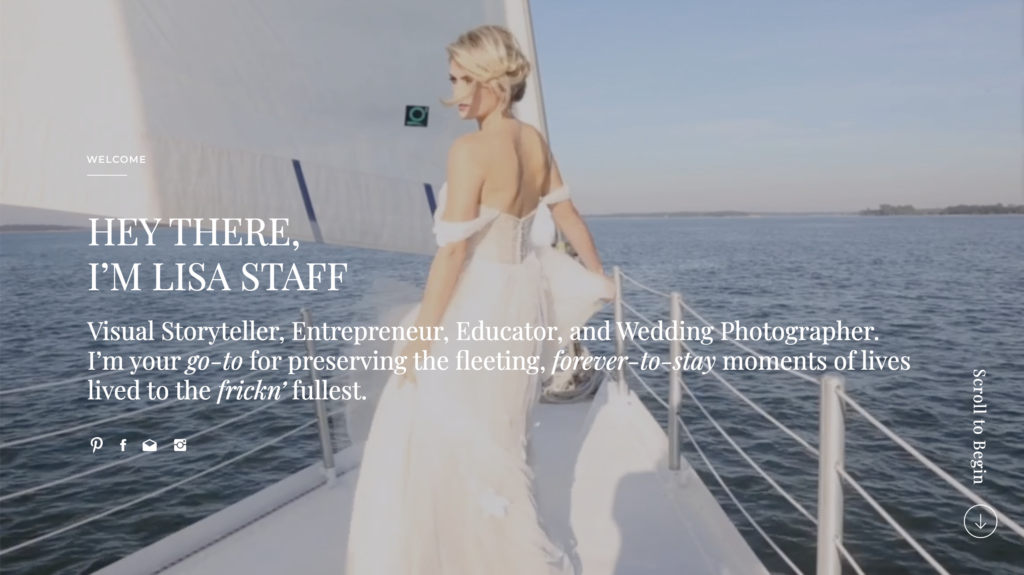
Using my new website as a case study, (DUHH, for lack of a lusher sample) and bearing in mind that putting your spin on things is always a right swipe, strap yourself in as I take you through 5 of the best tips to WOWing your prospects into customers through your website:

Simplicity
If there’s anything that flies over the top of my head, it’s how minimalism hasn’t gotten better rap than it deserves. You can never go wrong with a less-is-more vibe when it comes to websites. You want to play simple, subtle, and non-obtrusive.
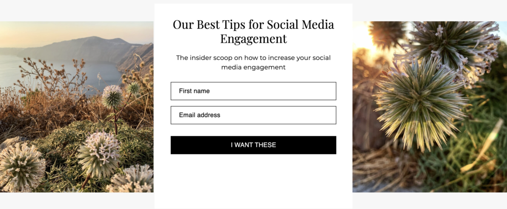
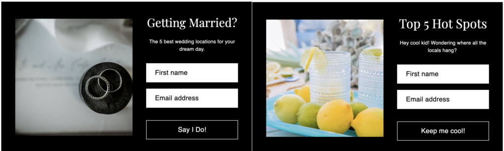
Keeping it simple means stripping down aesthetic overkills. Less clutter. Simple color combos and boldly highlighting unmissable parts of your copy you deem extremely crucial to your message.
Having Bite-sized blocks of readable text ensures your reader never loses track of the read, so it’s searchable and skimmable. And with 52% of web traffic generated with mobile devices, you want to put a more mobile-first twist to things. A minimalist design that fits smaller phone screens is the goal here.
Punctuate your website with clear, customer-oriented copy
Pretty much every web visitor is dialed right into the same radio station these days—the WIIFM (What’s in it for me) radio station. And ohh the let-off when they don’t find helpful tips, insider scoops on the seemingly abstract, and useful tidbits on how to access your services or even general growth content.
The trick to hacking this involves a bit of question-popping. Would find what meets the eyes (your website content) appealing or warm enough to command engagement? Ask burning questions like “what do I need to explain in such obsessive detail to keep them on my site for longer spans?” thus rocketing your chance of first sealing a long-term relationship, then a sale.
A well-written headline can be the difference between an engaged web visitor and a visitor who is just another statistic in your web page’s bounce rate. Your pages should only be as long as they actually need to be.
If writing is your Achilles heels, OR D-I-Y is your wheelhouse and you’re able to write SEO-rich copy that will have them both salivating and sweating at the same time, (again, like mine) but writing takes too much of your focus, and honestly, you’d rather have your fingers in other pies, hire one!
Web Navigation (Smooth as a glider or bust!)
And you better not be caught slippin’ when conversion-ready prospects are hovering around your website in search of that value-laden offering that’ll win their hearts and their wallets!
Your website should be a safe haven for your visitors—one where finding what they’re looking for should be the least of their pickles. Rock-solid yet seamless navigation helps you conveniently nail that sweet spot between search engine ability to index your web content and orgasmic UX (User Experience)
Your menu — whether the classic, horizontal list, or the more fancy ‘hamburger menu’ (eg. mines) — should be quick to locate, and, if possible, arranged in a hierarchy of importance.
Besides the all-important vertical navigation, you should also work on your header & footer, it’s a strategic point to foist your contact details, slogans, social media icons, and all that good stuff visitors are likely to seek about you/your business.
Embed Videos
Besides the plainly obvious likelihood that you quell your web visitor’s curiosity about how you do your thang’, thus drawing them into your world, embedded video arguable do a better job of relatably breaking down what you do to the viewer.
Factually speaking, 72% of consumers will rather see a video than go through a text-heavy website to understand your offering, and how it works. It follows that you grab this opportunity to story-tell your brand or create short, easily digestible explainer videos about your offerings and why you’re the best thing since sliced bread.
And that’s not even the best part. The ‘repurposable’ nature of videos means you can slap it on your social media channel and top it with some SEO-rich meta-description for optimum conversion.
Need compelling video content? The team at Sprout Connectors are suave, stonkingly skilled professionals who make video content creation for brand storytelling and any commercial purpose under the sun an absolute breeze.

Fix Broken Links
For the love of me, (and I’m speaking personally) I find web pages with broken links to be a serious red flag. Even google’s search engines agree with me on this one. It’s a telltale sign that the owner doesn’t care, attracting a silent “Why should I?”
Sadly, there are some website owners who’re totally blind to this as these links stop functioning and it goes undetected. That’s where HTML validators and other helpful link checkers come in to vet older links against link breakage.
More so, all that hand-wringing, brow-rubbing, and face-palming that follows the sight of a 404 error page when visitors should be getting all the info they signed up for when they clicked your website means they’re likely to never come back.

Parting Note
Calling all Entrepreneurs, creatives, photographers, and small business owners. Your website is your digital storefront, and you don’t get many chances to give your visitors the right impression about you and your business.
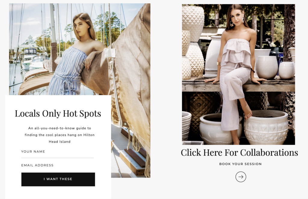
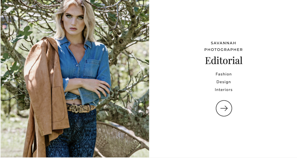
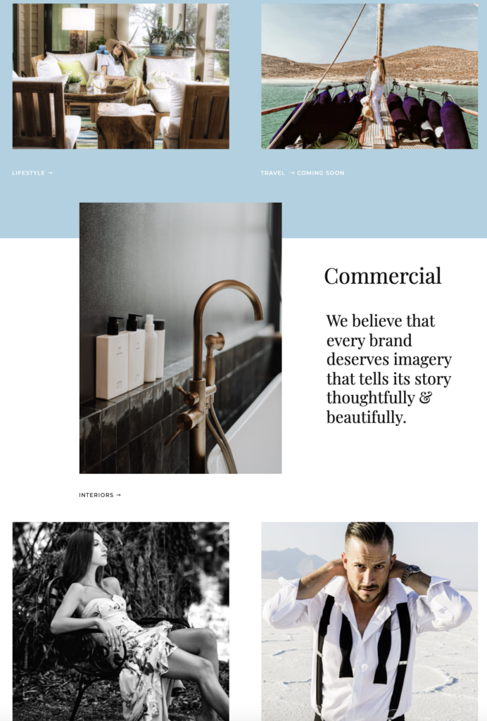
Instead of throwing a dart on the wall and hoping to miraculously land on a pipe-line of hot leads, why not put your house in order with a smashing website that would blow away your competitors using top-class Hilton Head Island photography (drop the stock photos like a hot potato!) and some down-to-earth, immersive video storytelling?
I wholeheartedly recommend Showit. They’ve made website creation and the maintenance part a walk in the park for tech-dummies who also happen to be fashion photographers like me, knowing jack all about a line of code.
If you’re a business without a website, Showit makes your transition into online seamless and… divine. Drag and drop with multiple functionalities? Check. Integratable with WordPress? Check. Plenty of design-engineered room to help you showcase your craft and book the clients you love? Check.
They’ve got excellent customer service too — ever-ready to help you find your way around.
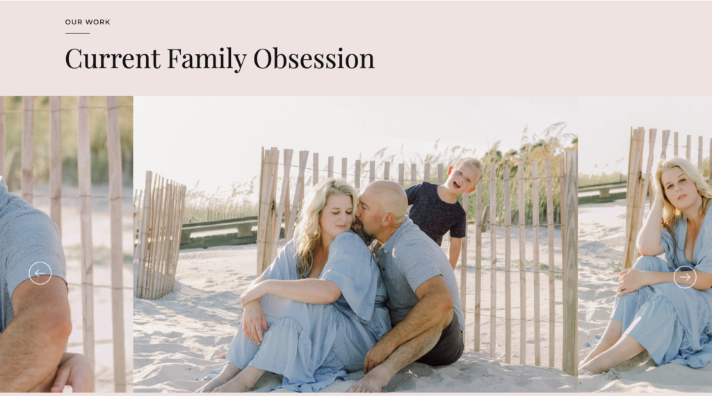
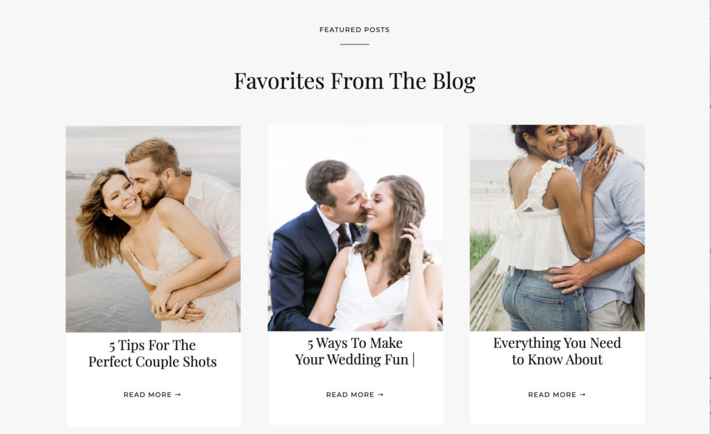
Want proof? Feel free to take a tour of my website. And while you’re buckled in, feel free to delve into a world of wanderlust featuring some of our top picks here!
comments +